Chester Park is an amazing resource for the residents of the neighborhood. However, the bisection of the park
by Massachusetts Avenue makes it difficult for people to utilize both halves, effectively cutting residents'
green space in two. Additionally, the lack of any type of pedestrian crossing across Massachusetts Avenue
between Tremont Street and Shawmut Avenue creates an unsafe environment where pedestrians are jaywalking across
Massachusetts Avenue out of convenience. We counted more than 30 jaywalkers in only one hour across
Massachusetts Avenue, in order to avoid the 4-minute walk that is required to cross at either Tremont or
Shawmut. We aim to provide an exploration of pedestrian behavior and crossing data in order to find potential
solutions to make it more practical to cross Massachusetts Avenue safely, and to give the residents of Chester
Square easy access to the full extent of the park. By balancing the advantages and disadvantages of installing
some type of pedestrian crossing, we hope to provide the Chester Square Neighborhood Association with a tool
to lead the pedestrian crossing discussion.
Our visualization focuses on the following options for a pedestrian crossing:
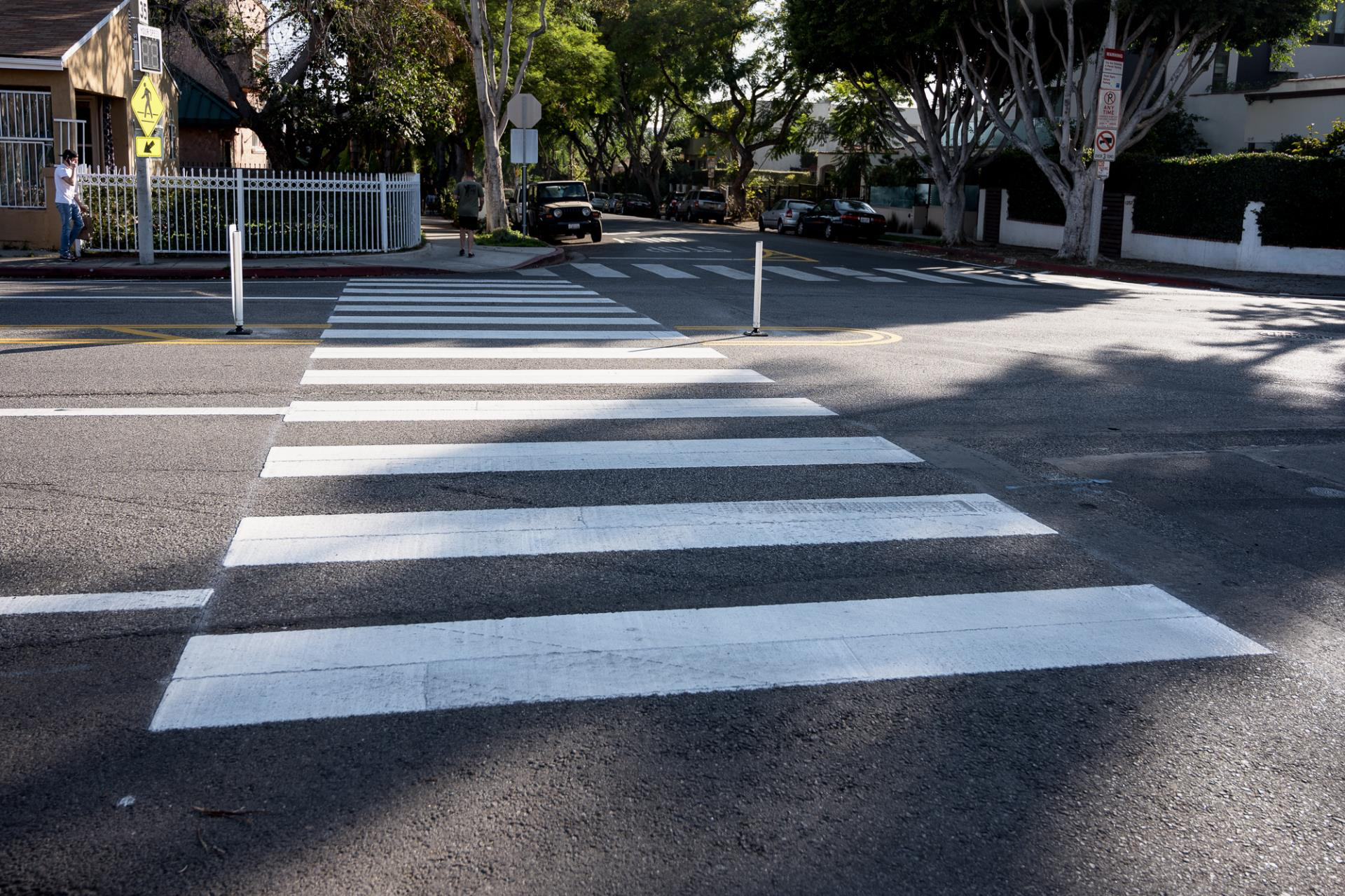
High-Visibility Crosswalk
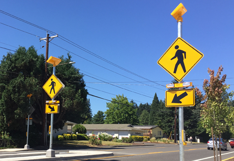
Rapid Flashing Signal
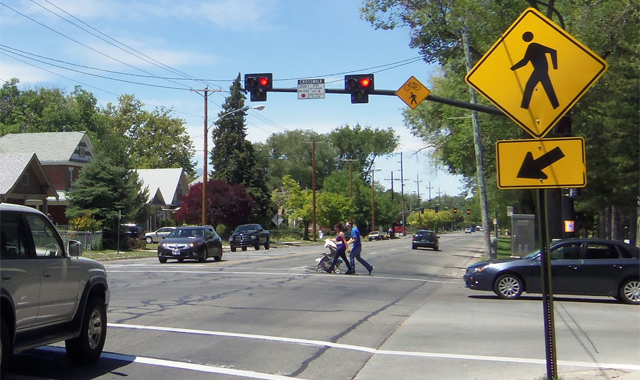
Pedestrian Hybrid Beacon
Visualization
Demo Video
Visualization explanation
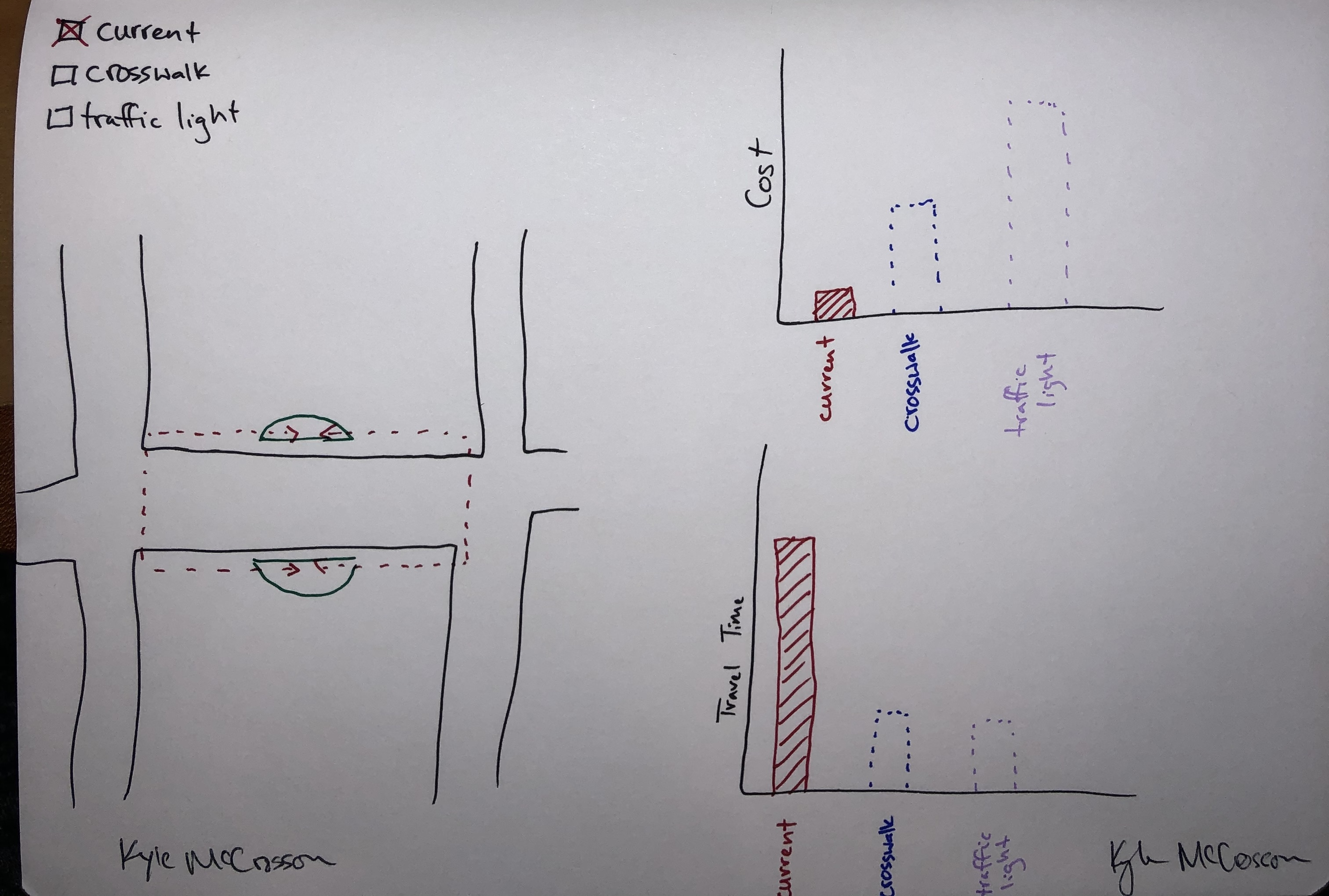
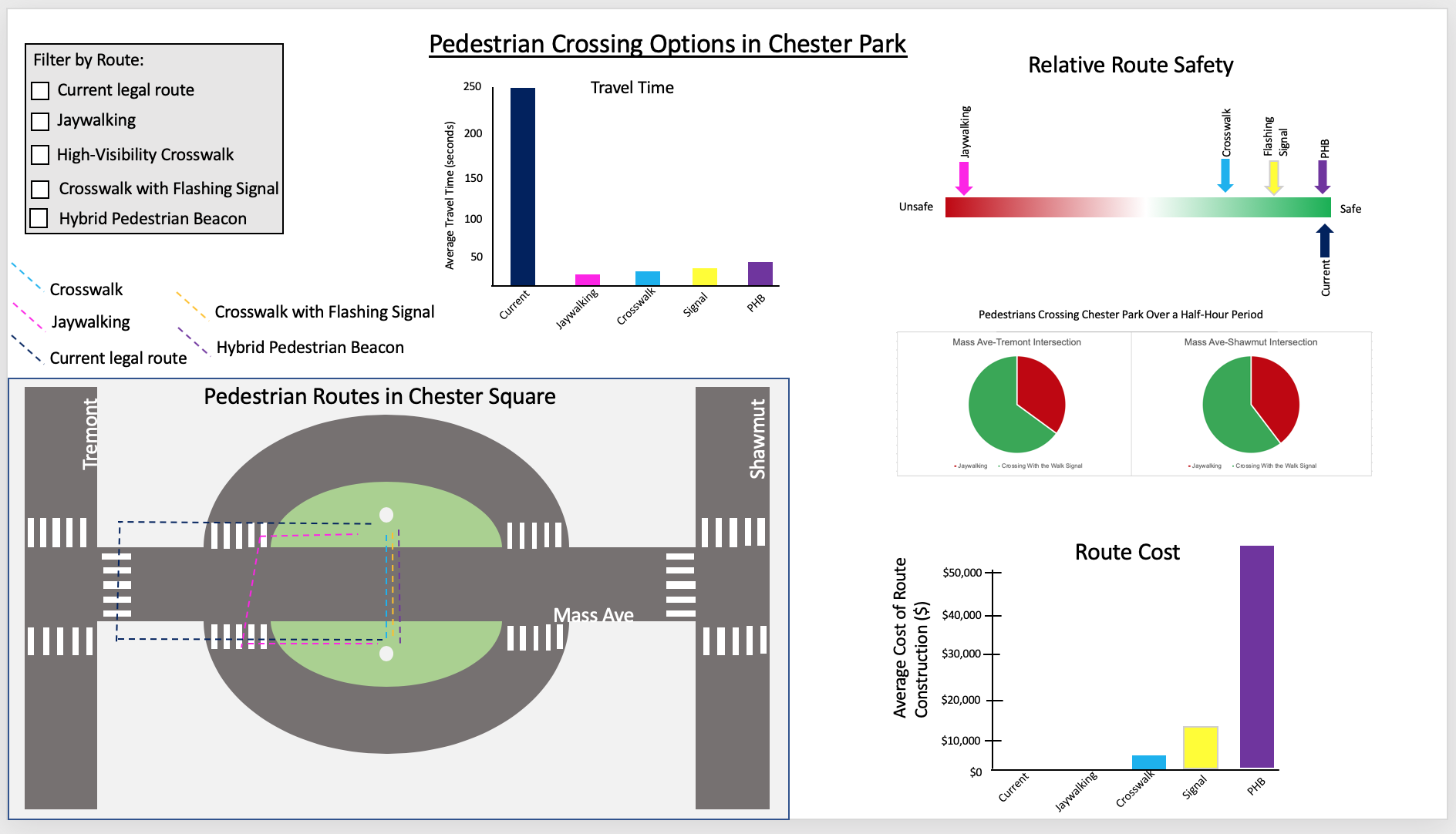
Our visualization is based on three main views that highlight the major pro's and con's of each choice of
pedestrian crossing. The options we explore include leaving the road as is (pedestrians either cross at
Tremont/Shawmut, or jaywalk), adding a crosswalk in the middle of the block, adding a crosswalk with a rapid
flashing pedestrian sign, and building a Pedestrian Hybrid Beacon which is essentially a stoplight over a
crosswalk that would give pedestrians the right of way. For simplicity, we refer to the Tremont/Shawmut
option only as Tremont because the travel times, costs, and safety of each of those routes are the same, and
discussing them separately is redundant.
In the lower left corner we have a map of the neighborhood, with the five options for pedestrian crossing
laid out over it. This provides the user with a spatial awareness of the various intersections involved, as
well as the context of where the proposed pedestrian crossing options would be installed. Hovering over each
path with the mouse will provide a tooltip label to tell the user which route they are looking at, and will
highlight the encodings related to that route in the other graphs on the right side of the
visualization.
The bottom right corner contains a bar graph that compares the average amount of time that it takes for a
pedestrian to walk the corresponding route on the map. The amount of time is encoded with length on an aligned
axis and the route that the bar is referring to is encoded with color. Comparing the length of the bars on an
aligned axis is the most effective way to relate that information to the user, and using the same colors to
encode the bars as we did the paths over the map (along with linked highlighting and tooltip labels) unites
the information from the map with the information from this bar graph.
In the top right corner we have a violin plot that provides information on the distribution of costs of various
solutions we felt could effectively connect the parks in a more effective manner than currently is available.
The distribution is encoded within the width of the plot at a given point, and the color encodes which route's
distribution you are looking at. Using the width it is easy to compare which have distributions that skew higher
or lower because they are using the same y scale so it's just a matter of comparing various widths and the
height on the y axis of those widths. We liked that this made it easy to get all of the data in perspective
unlike a bar graph of just the average or something along those lines.
In the top left corner we have a key which will highlight whichever route you hover over to make it easy to
compare across our various graphs in the visualization, and we also ahve a filter box that allows you to narrow
down the scope and more easily compare a smaller number of routes. This is especially helpful for the average
walking time, because Tremont raises the number of seconds needed for the graph dramatically which makes it
harder to see the differences between all the other options.
Data Analysis
Our data collection process involved gathering the spatial locations of all the routes we wanted to analyze,
recording the amount of time it takes to traverse each of the routes, and locating cost figures for each. To
gather the travel times, we recorded ourselves and other participants walking each of the five routes in our
analysis. Since the proposed options (crosswalk, flashing signal, and PHB) don't yet exist in the Chester
Square neighborhood, we had to find implementations of them surrounding intersections of Massachusetts Ave in
order to get accurate times. The cost data that we gathered came from a 2016 report by the UNC Highway Safety
Research Center. Since we were not dealing with huge or complex data sets, there was not much data processing
to be done. More of the power in our data comes from the storytelling around the layout of Chester Park and
how it might be improved.
According to the travel time data, the amount of time it takes to cross from one side of the park to the other
without jaywalking is almost 11 times greater than crossing the street directly (based on avg_travel_times.csv).
Jaywalking, crosswalks, rapid flashing signals, and pedestrian hybrid beacons all take a comparable
amount of time to cross. Although from this perspective jaywalking seems like a relatively inviting option
(it is quick and already is in place) it should be noted how much more dangerous jaywalking is as compared to
any other option of route. The outlier of this dataset is the legal walking route-- walking between the
halves of Chester Park by crossing at Tremont or Shawmut is by far the least efficient.
Because Massachusetts Avenue is a busy street, it would make the most sense to go for a pedestrian hybrid
beacon. This method of crossing completely stops traffic while pedestrians traverse the crosswalk. While the
average walking time is slightly greater compared to a plain crosswalk, it would add to safety. The downside is
that this is also the most expensive option, costing about 3.5 times as much to build. However, the higher cost
of this crosswalk would be offset by the additional safety, where a single potential accident on this road could
wipe out all the savings by not placing a signal. but this argument could be used to argue that any sort of
crosswalk would save money overall, because of time saved by those who would have gone around, and injuries by
those who are jaywalking. In general, the boosts in safety and speed are countered to some degree by an increase
in cost as well, so the best solution isn't completely cut and dry.
Task Analysis
Domain Task
High-Level
Mid-Level
Low-Level
Compare different options of park connectors and evaluate the overall effects of each
Compare
Explore
Discover
Find the potential downsides of each park connector solutions. This will be important for us to research further.
Identify
Explore
Discover
Examine the number of pedestrians that cross Mass Ave at Tremont and Shawmut, as compared to jaywalkers.
Compare
Explore
Discover
Determine which park connector solutions are viable based on their downsides. This will be important to
the Chester Square Neighborhood in making a decision.
Identify
Lookup
Discover
The largest overarching goal for our visualization was to provide an exploratory tool to facilitate discussion
within the Chester Park Neighborhood Association about how to best address the problem of a pedestrian
crossing in Chester Park. We wished to have an interactive map along with graphs of travel time and cost that
would help tell the story of the pro's and con's of how best to connect the parks. The map could be used to
demonstrate distance and give a spacial representation of the walking distance between the parks and walking
distance to get between them. The reason we wanted to do this was to explore our important domain task of
determining which solutions are the most and least viable from different perspectives.
Our intention is that once this exploratory tool is created, it can be a source of many constructive
conversations around improvements of Chester Park. Our research not only focuses on convenience for area
residents, but on the safety of the pedestrians in the area as well. The data we seeked to gather focuses on
how many people are jaywalking across Massachusetts Avenue, a very dangerous behavior that puts any person at
risk. The urgency of this data will hopefully spur action among the neighborhood association.
Initially, one of our tasks was to look more closely at pedestrian traffic. While we gathered data on
pedestrian behavior at the Tremont and Shawmut intersections as well as jaywalking behavior, none of that has
so far been included into our
visualization because we could not find a meaningful way to include that information without
cluttering our view. However, this information is still important for an overall conceptualization of this
issue.
Design Process
The first thing we worked on was setting a goal for what we wanted to do. This included planning out what
data we intended to collect for our project.
We then collected data over the course of several days based on the plans we had made by standing
at the intersections,
and counting how many people were crossing and in what manner. We also timed ourselves and others
to see how long it takes to get to one side of the park to the other.
Once we gathered the data, we moved on to create prototypes that would utilize our data.
We did not show all the data in our visualization, as some of that data wasn't going to fit in well with the
rest, but gathering an abundance of data
was useful in having a good selection to choose from when in came time to creating the visualization. Our
best first sketches all shared one common feature: a map of Chester Square with line representations of the
routes we wanted to discuss. Spatial location is the most accurate way to reflect data and there is no better
way to set the context of this project. From there, we knew that we wanted a collection of accompanying
charts to display some sort of useful information about these walking routes.
The sketch prototypes were useful for gauging what types of visualizations worked and which ones did not.
from this, we moved on to create a digital prototype of the sketch using PowerPoint. PowerPoint proved
to be useful sketch tool that was able to express a degree of interaction using slides
with demo interactions. The feedback that we received on the digital sketch revealed that we had tried to
shove too much information into a small frame, creating an overload for the users. This was when we decided
to remove the safety aspect from our drafts, as we were struggling to come up with a mathematical
way to represent and compare safety anyway.
After that point you can see our final draft of the visualization emerge as it is above. Color is used to
encode the walking
route of each piece of data across the whole visualization to give everything a unified feel. In the map,
routes are mapped out spatially with a line. In the bar chart, travel time is encoded with length on an
aligned axis so that comparison is simple. For the violin chart, cost is encoded with length on an aligned
axis as well, and distribution proportion is encoded with width of the violin shape. Hovering over any piece
of data in these three charts will highlight the data corresponding to that route in the other two charts,
as well as display a tooltip with more specific information relevant to that chart. Additionally, the
box in the upper left hand corner will allow you to filter the information that is displayed in all three
charts so that you do not have to look at all of the routes at once. Doing this will adjust the axes of the
bar and violin charts so that you can get a more accurate view of the information being displayed.
Conclusion
Over the course of this project we have spent a lot of time planning our data collection, implementing that
data collection, and creating a viable and useful visualization off of that material. The primary focus has been
on
the difficulty and danger involved in using both sides of the park - there
is not effective way to cross from one side of the park to the other. Our main takeaway is that there is no
perfect solution to this issue, rather there is an array of possibilities for the neighborhood association to
discuss. We hope that the data we have collected and presented aids their discussion and deliberation of the
matter. If we could go back and
improve, we would
try and collect data from more robust sources - what we ended up with provides interesting results, but
doesn't allow for as complex of a visualization as we would have liked. This would make for a more engaging
outcome.
Going forward, we would like to shift more towards the aspect of safety. We tried to provide some focus to
the matter
but it did not end up making the final cut of our visualization. Doing enough research and data collection to
accurately and effectively portray the relative safety of each potential pedestrian crossing would allow us
to create a more comprehensive view of the crossing issue. This would provide another important
factor in comparing different solutions. Additionally, it would make sense to investigate the effects our
solutions could have on commuters - how would the addition of these potential delays slow down traffic? These
and other questions would be important to answer. Only then could we would expect our visualization to shift
more towards making a final decision on the best solution. For now, we have set the basics out for a robust
and important discussion about pedestrian safety and convenience in the Chester Square neighborhood.