Chester Square Park was once a large, grassy park connecting the two sides of Chester Square, but has been
separated into two smaller green spaces
when Massachusettes Avenue was constructed to go straight through Chester Square. Now, the parks are not
used quite as often by Chester Square residents
and pedestrians alike, and the Chester Square Neighbors Association wanted to find ways to possibly enhance
the park so that people would get more usage
and enjoyment out of it.
Our study was centered around examining what current residents and pedestrians use
the park for, and how often the park is used.
Ultimately, we decided that making a visualization to address the question of what improvements residents
and pedestrians want added to the park would be
the most useful to the Chester Square Neighbors Association. That way, we can easily present to the Chester
Square Neighbors Association what residents and
pedestrians want to see enhanced in the park, and hopefully making those enhancements will help increase
park usage.
Visualization
Demo Video
Demo video explaining our visualization.
Visualization explanation
UI Walkthrough
Users can hover over any of the bars in the iso-type bar chart to see what the value of that category is (how
many responses total for each survey type for that category) in a tool tip. Additionally, when the user hovers
over one iso-type bar, the other iso-type bars are faded, making it easier for the user to focus on that one
bar of interest. When users hover over the iso-type bar chart, the corresponding bars for that same category
in the neighboring grouped bar chart get highlighted, thus introducing a linking effect. This helps show how
the response types were split for that category. For example, if the user hovers over the "Trees/Plants" iso-type
bar, then the "Trees/Plants" bars in the grouped bar chart all get highlighed simultaneously, showing the
breakdown of responses.
When users hover over any of the individual bars in the grouped bar chart, the number of responses is also shown in a
tool tip, along with the response type. Additionally, each bar in the grouped bar chart is linked to the iso-type bar chart,
such that when an individual bar is hovered over, only that amount of pictures on the corresponding iso-type bar chart is
completely opaque, and every single other picture in the iso-type bar chart is faded. For example, if one were to hover over
the in-person resident bar for the benches response in the grouped bar chart, only one bench in the iso-type bar chart is
completely opaque, and every single other picture is faded. This makes it easy for the user to get a bigger picture view of
how many people of each survey group picked a certain enhancement in relation to the total number of responses. It also
reduces noise from the other iso-type bars, making it easier to focus in on one survey type for one enhancement.
Data Analysis
The data we included is derived from four different CSV files for the different our response types:
Online Residents, In Person Residents, In Person Pedestrians, and Total Responses. The Online Residents data
indicates the data we collected from responses to an
online survey sent out by Carol Blair to residents of Chester Square. The In Person Residents data indicates
the data we collected from going to Chester Park ourselves
and asking Chester Square residents in person to answer the same questions from the online survey. The In
Person Pedestrians data indicates the data we collected from going
to Chester Park and asking pedestrians walking through the park to answer the same questions from the online
survey. Total responses is the aggregation of those three groups.
We used the Total Responses data for our ISO-type bar chart, and the other three individual response types
data for our grouped bar chart for comparison.
Task Analysis
The main task that we wanted to address was the question of "What enhancements do current residents want to see
added to the green spaces in Chester Square Park?" At a high level, our task was to discover some different options
of enhancements that people may want to see added to the park. To do this, we came up with some ideas ourselves,
talked with Carol Blair of the Chester Square Neighborhood Association, and allowed for survey respondants to
give their own ideas with a fill-in "other" survey response option. So, the options that we discovered became the
x-axis of both of our visualizations.
At the mid-level, our task was to explore the options that we had discovered at the high level. This is where our
survey came in handy. We distributed a survey to residents of Chester Square online and in person, and to pedestrians
in Chester Park in person, and one of the questions was our main task question. Using our tool, one can explore the
different options that people voted for, and even break them down by survey type.
At the low level, our task was to ultimately identify the enhancement that most people would want to see added to the
park. And the answer, ultimately, depends on which survey group you're focusing on. Using our visualization, it is
clear that overall, people want more trees and plants added to Chester Park. However, looking at the response breakdowns
in the grouped bar chart, the majority of online residents and in-person pedestrians want more trees and plants added
to the park, but the majority of in-person residents want art installations added to the park. So, our main task does
not have a clear cut answer -- it depends on which group of people you're focusing on.
Design Process
Sketches and design choices to justify final visualization.
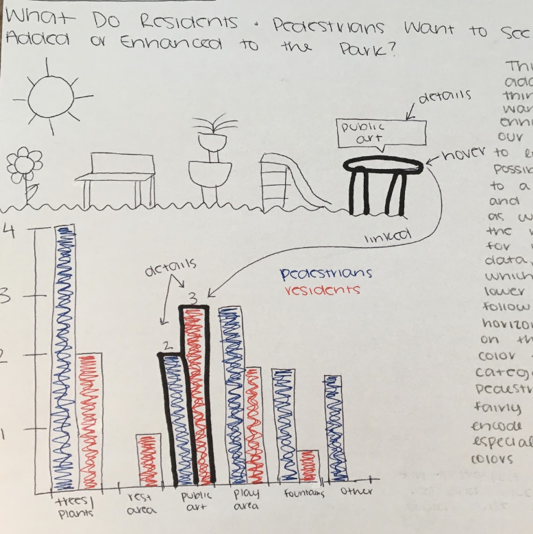
Ultimately, we decided that using a single bar chart with a juxtaposing grouped bar chart would be the most
effective way to display the answer to our main question of
"what do people want to see added to Chester Park?" It is effective because both visualizations make use of
the vertical spatial position channel in order to encode the quantity
of people who chose each enhancement as the one that they want to see in the park. This makes it really easy
for the user to quickly and effectively encode the data upon first glance,
as they can easily tell that the highest bar is the enhancement that the majority of people said that they
would like to see in the park. We made the single bar chart an isotype bar
chart because the pictures made the visualization and little more fun and engaging, and it is helpful that
the number of pictures corresponds to the number of responses, so that the
user can count them to get an exact number if they want, rather than trying to guess by following the top of
the bar to the y axis on the left, which is especially hard to do with
pictures (but we also added details on demand for this reason so that viewers do not have to manually count,
but they could if they wanted to).
We also decided to use a grouped bar
chart because we had three different groups that we surveyed, so breaking the results from the isotype bar
chart down into their respective groups allowed for the user to get even
more insight about what kinds of enhancements people want to see added to the park. The grouped bar chart
uses the same vertical spatial encoding that is easy for the user to
understand. It also uses color encoding which is a valuable tool because it allows viewers to easily discern
the different groups. We thought these visualizations would be of great
use to the Chester Square Neighbors because not only can they get a high level idea of what things people
want to see added and enhanced in Chester Park, they can also see how that
breakdown looks in terms of pedestrians and residents, and even further in terms of residents who responded
to an online survey and residents who were actually using the park. That
way, if they want to target one specific group, this tool allows them to do so.
Conclusion
In conclusion, there is no clear cut answer to the question "What enhancements do people want to see added to the
green spaces in Chester Park?" The answer to that question depends on which group of people you are focusing on, which
is really valuable for the Chester Square Neighborhood Association, so that they can make informed decisions about
improving the park depending on which group of people that want to focus on. Overall, adding more plants to the
green space and maintaining the upkeep of the trees in the park would be a great enhancement to start with to satisfy
the majority of people who care about and use the park. However, art installations would also be a great idea to satisfy
the residents of Chester Square who were surveyed in person, so they definitely make use of the park. Additionally, the
"other" bar in the grouped bar chart shows some responses that were not included in the survey but that some people want
to see enhanced, so that is another great resource for the Chester Square Neighborhood Association.
In the future, we would love to survey even more residents and pedestrians of Chester Square in order to gain a more
robust data set that could ultimately create a more informative visualization that represents the wants of a greater
sample of people. In addition, the survey that we conducted had a lot of other questions on it relating to demographics
such as age, gender, kids, and pets, so it would be interesting to add more visualizations linking those demographics to
their responses.